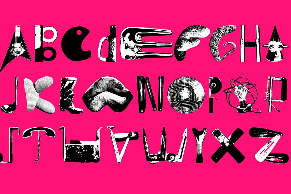
For the first graphic design assignment, we had to create two different alphabets made out of objects in our room that form or resemble letterforms. We also had to write the word “dream” in our native language with both of them, so below you can find the portuguese word “sonho”.
While designing these, I played with silhouettes and thresholds, which lead to two versions of each alphabet. In order to add contrast, I primarily focused on finding opposing aesthetics, which allowed me to tell different stories with the same word.
The first one is has an urban, modern, bohemian vibe, while also being playful . Here you can find images of the original objects and their evolution into a font.
Whereas the second one emanates a nature oriented, symbolic, cultural energy, allowing for more organic and fluid shapes.