2 alphabets, 2 different feelings.
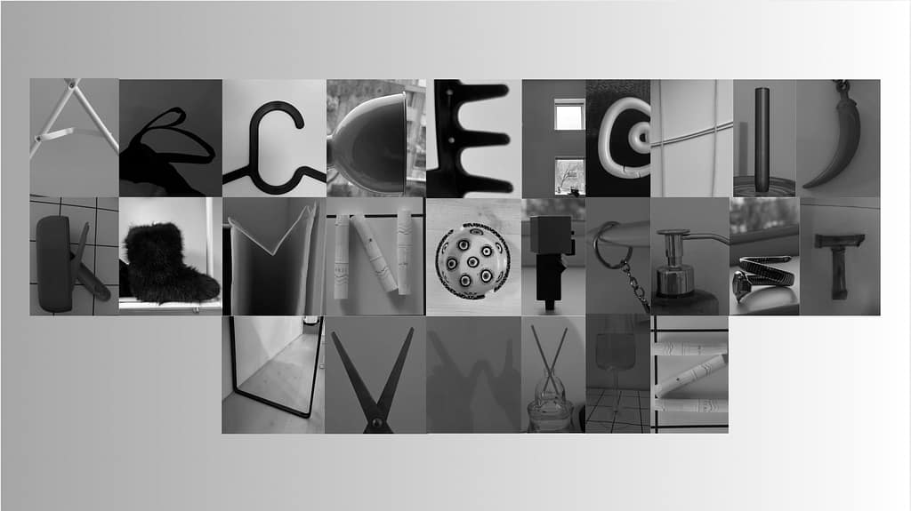
this is the more raw alphabet , with sharper lines and stronger . they are direct and straight to the point, no uncertainty about who are they and what they stand for .
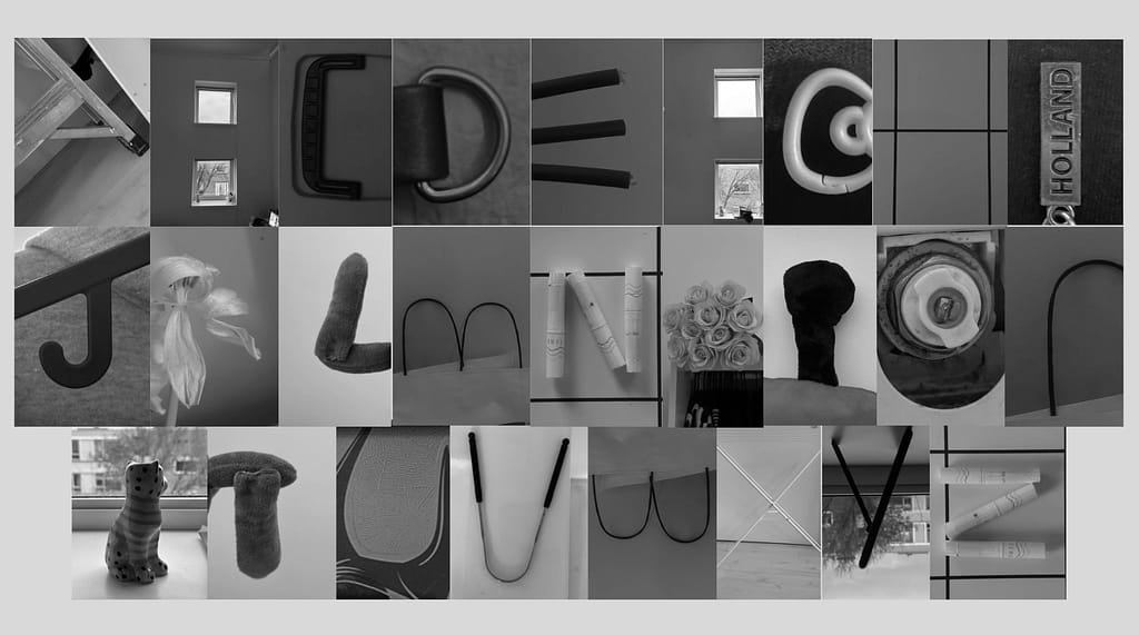
this is the softer and more whimsical one . filled with softer textures and shapes , organic and precise .
the word dream (in the better meaning) . мечта – [ mechta ] i chose to write it with the latin letters , because I use them all the time when writing in my mother tongue (bulgarian) . we have a beautiful yet complicated alphabet (cyrillic) and I find the latin one more close to my heart .
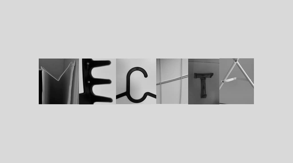
typography
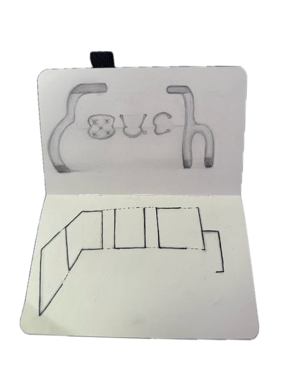
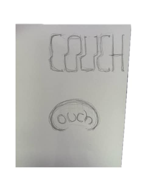
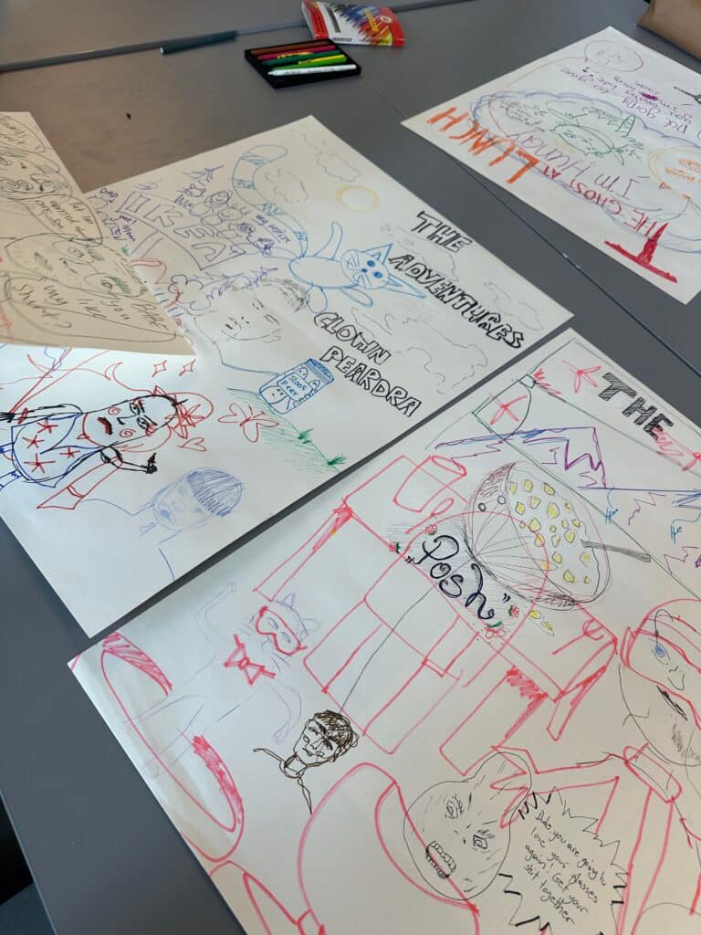
” couch ” – a long upholstered piece of furniture for several people to sit on .
” typography ” – the art, technique and arrangement of type – letters …
for these drawings I had to make the word into its meaning .
postcard illustration
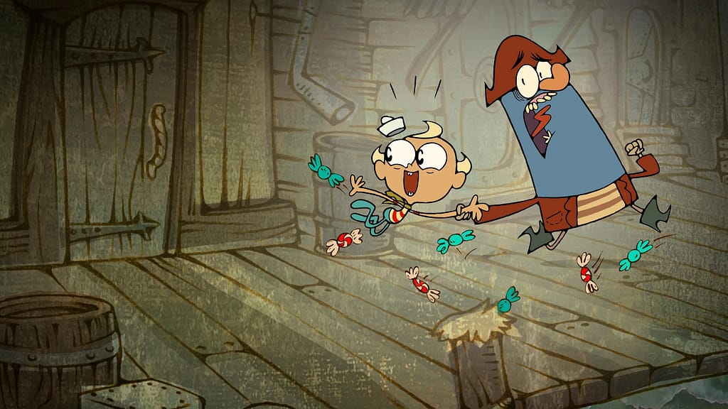
this image is from one of my favourite shows as a kid “the marvellous misadventures of flapjack”. i made into a post card written to my best friend Leni expressing my gratitude for her and how I see us in those 2 characters. they may occasionally be mad at each other, but in the end of everything they are as close as family .
bits and pieces
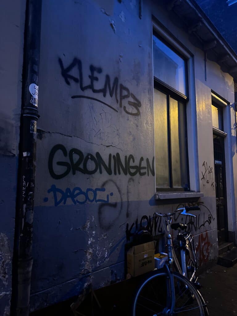
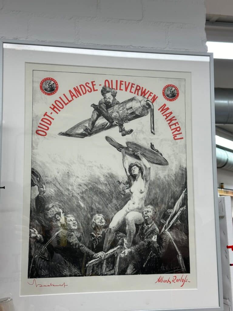
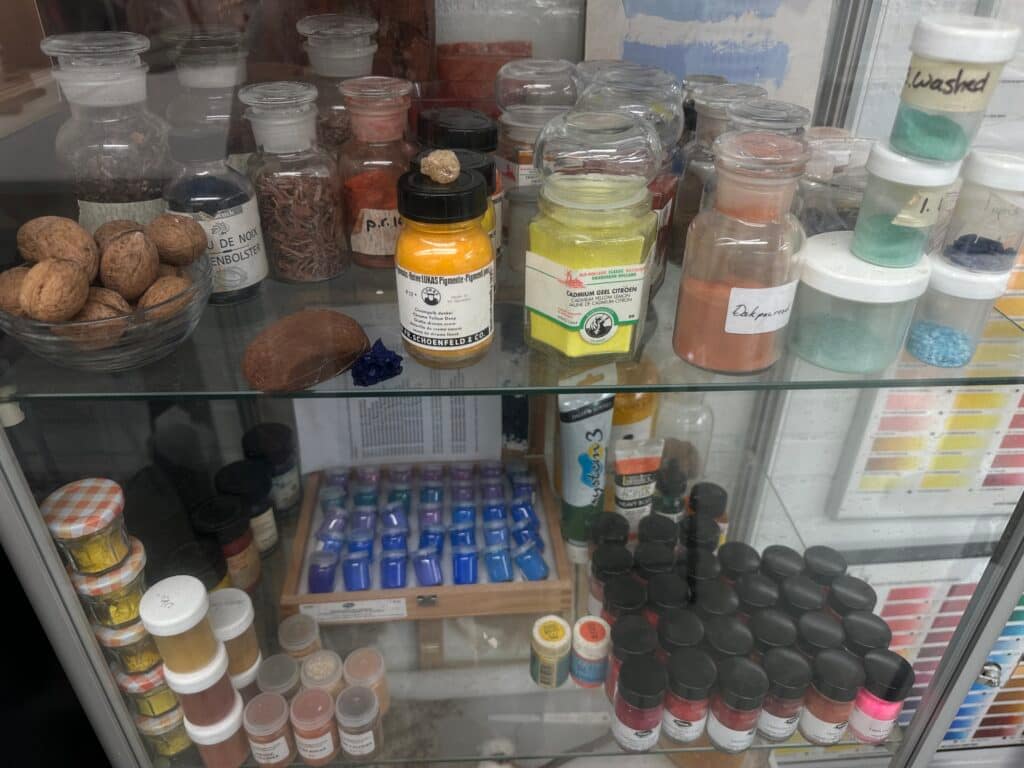
these are pictures of things I found inspiring and interesting to look at .