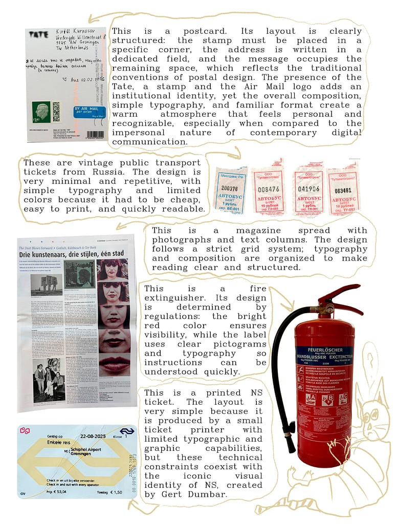
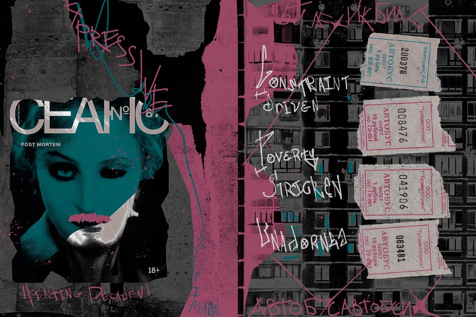
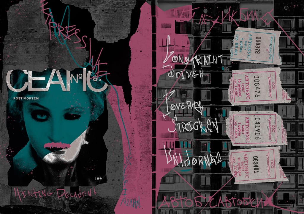
Spread 1: Off Grid is inspired by street graffiti and the layered visual language of the urban environment. The composition is based on the cover of СЕАНС magazine, an issue dedicated to ruins and decay: black-and-white photographs of destroyed walls form the background, partially overpainted in pink as a gesture of intervention and reinterpretation.
The cover of the magazine functions as a single image split across two pages: fragments of a face are divided by the page boundary and only fully revealed when combined, creating a sense of suggestion and incompleteness. This approach defines the work as expressive, allusive, and slightly decadent.
The second page incorporates elements from old Russian transit ticket design, utilitarian, stripped of decoration, and shaped by constraint rather than aesthetics. The background features a Soviet panel apartment block, whose architecture reflects the same logic: constrained, poverty-driven, and unadorned.
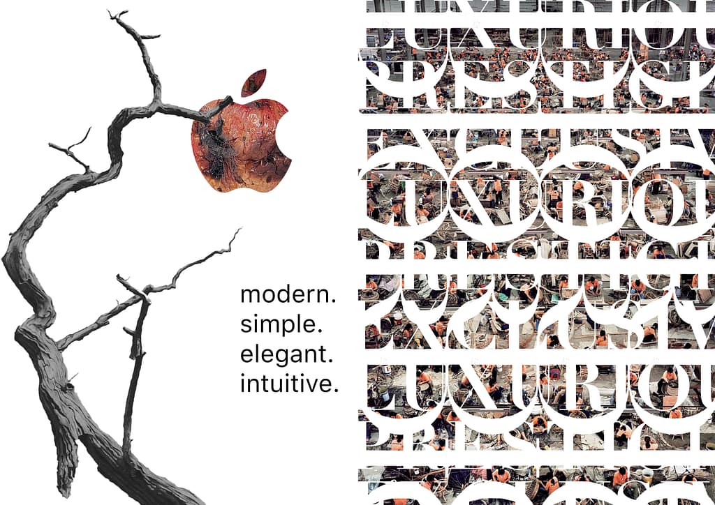
Spread 2: On Grid is is more symbolic and intuitive, shifting towards commercial graphic designs. It incorporates the logos of two major brands, Apple and Dior, exploring contrast and critique.
On the first page, the Apple logo appears as a rotting apple hanging on a dried tree. This image contrasts sharply with the accompanying text, set in Apple’s signature typeface, San Francisco. Using this font, I wrote the words Modern, Simple, Elegant, Intuitive, qualities often associated with the brand. However, behind these descriptors, the spread functions as a form of social and environmental critique, addressing issues of ecological impact and the way branding can mask underlying realities. The tension between the clean typography and the decaying visual highlights this contradiction.
For Dior, vertically repeated logos intersect with the words Luxurious, Prestigious, Exclusive, forming a rigid grid that resembles a barrier. Behind this structure, workers in a textile factory are partially visible, obscured by the dominant language of branding. This juxtaposition points to the invisibility of labor behind high-end fashion’s slogans and names.
Here are 10 graphic designs divided into 2 groups: utilitarian, constraint-driven design and commercial design.